The Power of Colour Theory in Branding and Marketing
It’s a well know theory that our surroundings influence our emotions, and every colour has a meaning. By adopting this theory in brand development and marketing touchpoints, we can influence how colour can impact your audience’s perception of you.
Colour theory is the fascinating intersection of science and art that explores how we perceive, mix, and contrast colour and the messages they communicate. Whether you’re designing a logo, packaging, or a website, understanding colour theory can make or break your brand’s success.
Why Colour Theory Matters for Your Business
Did you know that people decide whether they like a product within 90 seconds, and 62-90% of that decision is based on colour alone? Colour isn’t just aesthetic, it’s psychological. When you think of Coca-Cola, what comes to mind? The bold red can, right? That’s the power of strategic colour branding.
The Psychology of Colour in Branding
Different industries use colour to evoke emotions:
Law firms often use blues (trust), browns (masculinity), or yellows (competence).
Food brands use reds and yellows (appetite stimulation), think of McDonald’s, Burger King.
Choosing the wrong colour can hurt sales.

Creates a sense of urgency. Associated with movement, excitement and passion; is high energy and immediately pulls focus.
Creates a sense of calm, peace and tranquillity. Associated with a sense of security and promotes trust. The younger generation associate blue with maturity.


Stimulates harmony in the brain and encourages balance between body and emotions. Associated with life, growth, nature and freshness as well as money and wealth.
Represents creativity, wisdom and imagination. Often associated with royalty and respect and also stimulating the problem-solving areas of the brain.
Increases cheerfulness and optimism. Stimulates the logic centre of the brain and promotes enthusiasm. Associated with innovation, creativity, thinking and ideas.
Associated with authority, power, stability and strength. Often used to symbolise intelligence. Can overwhelm people if used too frequently.
Creates feelings of practicality, timelessness and solidarity. Too much grey often leads to feelings of nothingness.
Associated with feelings of purity, cleanliness and safety. Using white can spark a sense of creativity since it acts as a clean slate.

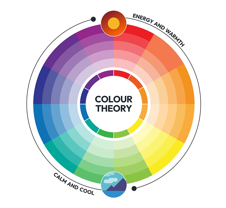
How to the colour wheel is used in design
Sir Isaac Newton invented the colour wheel in 1666, and it’s still essential today. The wheel helps create balanced and visually appealing colour schemes:
Complementary colours are opposites on the Wheel e.g: Red & Green, Blue & Orange. Their effect is high contrast, bold, and eye-catching.
Analogous colours are positioned next to each other e.g: Blue, Blue-Green, Green.
They are harmonious and soothing.
Triadic colours are three evenly spaced hues e.g: Red, Yellow, Blue. They are vibrant and balanced, often used in playful designs.
Choosing the Right Colour Scheme
Colour theory isn’t just for artists, it’s a business tool. The right colours strengthen your brand, influence customer decisions, and set you apart from competitors. Whether it’s for designing a logo, website, or product packaging, a smart colour strategy can mean the difference between your brand blending in or standing out.
Also read our building a brand persona blog.
Want to Read More?
Check out our Blog post below
